As humans, our association with colours is extraordinary. In our everyday lives they influence emotions, perceptions, choices, and perhaps a lot of decisions. Marketers mindfully leverage this point to instigate sentiments and trigger desired behaviors in their prospective customers.
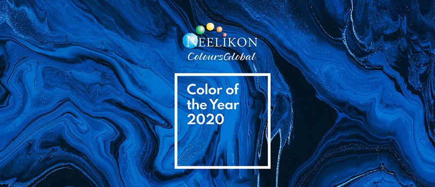
From packaging to interiors, the application and use of colours is far-ranging. For over 20 years, the Pantone Colour Institute has motivated product development and purchasing decisions in multifarious industries including fashion, interiors, product packaging and graphic designing.This year, in their impressive reveal, Pantone Colour Institute announced “Pantone 19-44052 Classic Blue” as the colour of the year 2020.
“Instilling calm, confidence, and connection, this enduring blue hue highlights our desire for a dependable and stable foundation on which to build as we cross the threshold into a new era1.”
Leatrice Eiseman, Executive Director of the PCI adds, “Classic Blue encourages us to look beyond the obvious and expand our thinking; challenging us to think more deeply, increase our perspective and open the flow of communication.”
As per the psychology of colours, blue, is perceived as non-threatening and peace-inducing colour; often associated with productivity, calmness, stability, and tranquility. Blue in its materialization can bring about a sense of control and security, besides passing off as systematic and decorous.
The sincerity of blue is also mirrored in nature through the boundless sky and deep oceans.It remains as an inspiration for humans to perform and succeed. Intuitively, dressing in blue reflects the aura of being serene and composed, radiating a semblance of control, confidence and reliability.
That said,the colour blue is also stereotyped with usage of terms like ‘Monday Blues’, ‘Blue Moon’ etc., which in turn reflect it in a relatively darker light – connoting gloomy and low-energy traits. Blue on its own has a melancholic tinge. Excessive exposure to this can even make one feel detached, overwhelmed, and glum.
Still and all, in the coming days, watching the manifestations of Classic Blue will be an interesting watch, to see how brands will advantage the hue to induce the desired behavior in their market.
Neelikon’s complete range for Pantone Colour of the year include:
Neelicol Brilliant Blue FCF, Neelicol Indigo Carmine, Neelicol Patent Blue V, Neelilake Brilliant Blue FCF Lake, Neelilake Indigo Carmine Lake, Neelilake Patent Blue Lake, Lavanya Aasmani, Lavanya Aasmani Dispersion, Lavanya Belmont, Lavanya Belmont Dispersion, Lavanya Gagan, Lavanya Aurea, Lavanya Blue Bell


One comment
Alan Palmer
April 21, 2020 at 11:26 am
Hi
Your item is both interesting and innovative . As I am sure you will realise my interest in all aspects of colour and interaction with our brains has always fascinated me
Keep up the good work
Comments are closed.